The Definitive Guide to Animation Styles
You’ve looked everywhere… wide and far on the tangled web…and finally… here it is. THE Definitive Guide to Animation Styles.
Who should read this?
Anyone who needs to better communicate with designers or clients
Anyone who nerds out on animation (yeah- you know who you are)
Anyone who WANTS A DINOSAUR TO CHASE THE MAIN CHARACTER IN THEIR VIDEO!
Let’s be realistic. You can do things with animation that you simply can’t do with a live action video. You can recreate the Jurassic age, put characters in space, and explain really complex information. You can evoke emotion and control a mood. AND, simply put, animation is just really, really cool.
The challenge of course is that there are so many different types of animation, and no standard way of referring to them. An animation artist may call a style “2D Vector Style” while the client says “whiteboard style.” We’ve created this guide to categorize the most popular traditional animation and computer animation styles, and give you the words you need to discuss them with creative teams.
So….read on! Or cheat, and watch the video!
The Disclaimer
We admit that we are not the animation style police and that others may use different terms to describe various styles. We have made every attempt to find the most commonly used terms for the most common animation styles. Animation is also a very creative and hard-to-define art form, because anything you can imagine you can create on the screen and make it move. There are many hybrid styles and variations on the styles listed below. For example, you could create a 2D animation with certain 3D elements (a very common practice). The possibilities are endless.

The Four Main Categories of Animation Styles
2D Digital Styles
Vector style (AKA Motion Graphics)
Hand drawn style
Cartoon Style
Kinetic Typography Style
Animated Infographic
Digital Cutout
Rotoscope
Isometric (AKA Cubic, AKA Low Poly)
3D Digital Styles
2.5D
Photorealistic
Cell Shaded
Simplified Geometric (AKA Low Poly)
Digital Claymation
Analog Styles
Whiteboard
Claymation
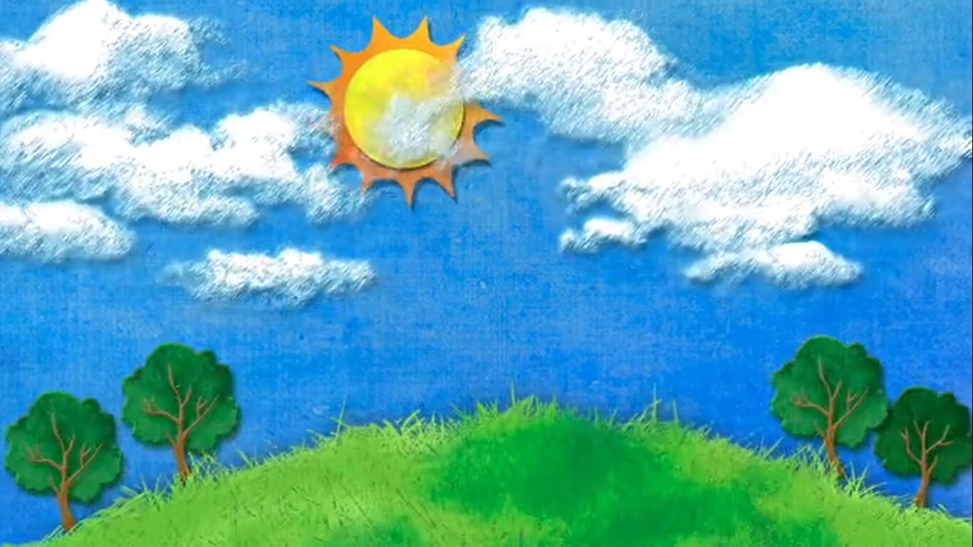
Paper Cutout
Physical Stop Motion
Art Stop Motion
Hybrid Styles
Live action and animation
2.5D and 3D Mix
Kinetic Typography and Vector Motion Graphics
The 2D Styles
Vector Style
(AKA Motion Graphics)
We’ve put this style first because it is probably the most common corporate animation style out there. It is popular for a few reasons:
It’s one of the easiest to produce and make look nice
It relies on iconic and simplified images, which is a great way to get across many corporate messages (especially complicated ones)
You can avoid time consuming and tricky character animation and therefore getting the dreaded feedback from your client, “It’s too ‘cartoony’ for our brand.”
A central feature of the vector style animation is that the assets are created in a vector program such as Adobe Illustrator or directly with Adobe After Effects. No attempt is made to make things appear hand drawn or too organic.
Use of characters is minimal in this style and when characters are used they are usually not fully animated (walking talking, different facial expressions.)
This is one of several styles that many clients will refer to as an “Explainer Video”. That term is used so broadly that it is not particularly helpful in pinning down an exact style.

Hand Drawn Style
This style is popular because it can give the appearance of being hand crafted, organic, and personal. Often, the technique involves actually drawing your assets with a digital pen and input device, such as a WACOM tablet, and choosing brush strokes that enhance and emphasize the hand drawn esthetic.
Also, you can further the effect using grungy textures and by individually animating each line to give them each a life of their own. Often this technique is paired with a lower frame rate to further enhance the effect.
The hand drawn shapes and textures coupled with lower frame rates force the brain into a different way of perceiving the images. This is also a very diverse style that can be executed in a very clean way or a very chaotic way depending on the mood you are going for in your work.
A Coke is a Coke
Clean Water out of Desert Air
Cartoon Style
Often, we animators working with corporate clients fear the dreaded phrase, “That looks too cartoony for our brand.”
Clients seldom know what they are actually referring to when they say this. Many animators don’t know what the term actually means and there is no universal definition of the term.
For our purposes, let us agree that “cartoony” refers to a children’s cartoon. This could be anything from Disney cartoons or Looney Toons to more modern Cartoon Network styles. While there is a huge variety, all cartoons are based around characters that have exaggerated and simplified features. There is also a specific way of exaggerating the movement to draw the eye that is fairly unique to cartoon animation.
In our experience, anytime you introduce any character of any kind into a corporate animation, the word ‘cartoony’ is thrown out there, and almost never in a positive way. Most corporate videos are not geared to a child audience, so this is understandable.

Kinetic Typography
The rules of this style are pretty simple. Convey your entire message using only text. The way the text moves, animates in, the typeface, background textures, etc fill out your message. Some minor complementary animations can be used such as in the “Word Crimes” examples here, but the typography must be central to the animation in order to qualify as Kinetic Typography.

Animated Infographic
An infographic seeks to take a lot of information and convey it in the form of unique and interesting graphs and charts connected with arrows and other elements that guide your eye through the information.
We’ve all seen many infographics out there and if you add some animation to one of these and turn it into a video Voila! You’ve got and animated infographic.
Adding animation gives you more control over when and where your viewer is looking when compared to a static infographic. If someone has already designed a good infographic for you, they have done half of your work.
There is a pretty grey line between this style and a Vector Animation. I’d say if your animation has more graphics and statistics than other types of symbolic or character animation, it’s an animated infographic.
This is another style of video that is often referred to as an “Explainer Video” which is a more generic term that can be executed in a number of different styles.
Digital Cutout
This style is kind of like a digital collage. It involves scanning images from various sources or at least making it look like you’ve scanned images or cut up paper with scissors and animated it.
Usually the cutout style is very rough and the animation style is simplified and low frame rate. South Park was one of the original and most popular examples of this style. That started out as a real physical paper cut out method, but now everything is done digitally.
Going digital allows you to do certain things more easily than if you are trying to do 100% physical cutouts. Examples include lip syncing and eye movements.

Rotoscope
Rotoscoping is a technique that has been around since the 1880’s. It involves tracing over a real image, frame by frame to create a hand-drawn, animated version of it. This technique was used to hand paint the light sabers in the original Star Wars movies. You can also see a fairly famous example in the Take On Me music video.
There are many uses for rotoscoping and it can be used to create a very realistic effect or a more raw, otherworldly or imaginative effect. In modern times it is more often used to achieve a hand drawn, rough looking effect since realistic effects are much easier to accomplish using a variety of other VFX techniques.
Isometric (AKA Cubic, AKA Low Poly)
Technically speaking, this is short for Isometric Projection, which is a technical and mathematical way of visually representing 3D objects in 2D space. The style started as a way of doing certain technical drawings but has become popular in video games and now in corporate explainer videos.
Because of the mathematics of this style your animation will look kind of 3D but not quite and the ‘camera’ will be at a particular angle and can never change from that angle and perspective. You can move, animate and even rotate objects with your faux 3D world but things will never be actually 3D.
Within After Effects, you can create an isometric style all in 2D space (tutorial here) or you can create a 3D camera and set it to a particular zoom and angle to emulate an isometric projection. This method is a lot more efficient and allows you to do more effects. (tutorial here)
The 3D Styles
2.5D
Although After Effects is not a full blown 3D animation program, it has some 3D functions. Importantly, it can create 3D cameras and place 2D objects in 3D space. In fact it can import fully 3D objects and you can even animate camera moves and apply textures using third party plugins such as Element 3D by Video Copilot.
For this style, we are only talking about using 2D objects that you can create within After Effects - or import and place them within a 3D space, using a 3D camera and lights. This means you must limit your camera to certain movements and angles so as to not reveal your 2D objects. You can create camera dolly movements and parallax effects using this method.
Another common way this term is used is to describe 2D photos that have been separated into layers and 3D effects and parallax have been added. See the Parallax Slideshow for an example.

Photorealistic
Photorealistic 3D animations are created within full 3d applications such as 3DS Max, Maya, or Cinema 4D. This is a very time consuming and expensive style because every object has to be fully modeled in 3D space, accurate textures applied, lighting and cameras created and animated, and of course the very time consuming rendering process.
Most Pixar films are created in some variation of a photorealistic 3D style. For corporate animations, there are times when full 3D is needed. For example, if you need to show a complex 3D product and want to show the actual movement of the parts or the interior of the product, you simply can’t do that without creating it in 3D space.
In terms of cost, where you may pay $5K-$10K for a minute of other animations, full 3D can cost $15K-$50K per finished minute (or more) depending on the complexity of the scene.
Cell Shaded
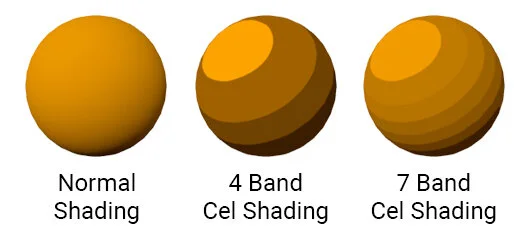
The term ‘cel shading’ comes from the old days of animation when artist would draw directly onto sheets of clear celluloid to create a 2D animation on film.
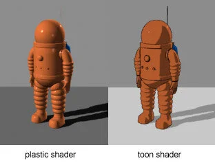
Today it refers mainly to a 3D technique where you build 3D objects, but rather than rendering them with normal textures, you use simplified shaders that simulate the 2D look of hand animations.
Video games like Zelda Wind Waker and Borderlands use this type of shading to achieve a unique and stylized look. It has the size benefit of being much easier and quicker to render than normal shaders.
Simplified Geometric (AKA Low Poly)
This style could be seen as a variation of the Cel Shading style. It involves creating 3D models but drastically limiting the number of polygons on the actual shapes to create a geometric look. It is often combined with cel shading for an even more simplified look.
Digital Claymation
Another variant of 3D animation is to texture your objects as if they were made of clay. This allows you to achieve certain things that are not possible with actual claymation and allows you to use 3D artists that perhaps would be unable to actually sculpt clay but are able to sculpt 3D objects and texture and light them to look like clay.
The Analog Styles
Whiteboard Style
This is the style we are asked the most about, and the style that is the most misunderstood.
For clarity let’s first define what a whiteboard video should be. A whiteboard video means you have planned out all the visuals, setup a camera above a whiteboard, and film an artist drawing out the planned images.
Then you bring the footage into an editing program and speed it up and retime it to match with your script. Some artists will bring on other elements such as paper cutouts and simple animations to supplement the actual drawings. The advantage to this method is that you are not actually animating anything. You are simply retiming footage and using the action of a human hand drawing to emphasize particular points.
If you are going to create a really good whiteboard animation you need to have an engaging topic and excellent writing and then spend at least 30 hours developing the drawings and have your artist practice and plan how they will draw them to match with the script.
So while the animation time is much shorter, by the time you script, storyboard, plan, setup the camera shot etc, you are usually using as much time as some of the other animation styles. One plus is that you can pull this animation style out with limited After Effects experience and do all the editing within Premiere Pro, Final Cut X, Davinci Resolve, or any other editing program.
This style is great at
Explaining complicated and scientific topics
Feeling natural and authentic because of the unpolished nature of whiteboard drawings
Being simple due to the constraints of the style of whiteboard drawing (line drawings with a few color options)
Warning: You get what you pay for
There are inexpensive plugins for After Effects that can be paired with generic stock drawings to recreate the look of a whiteboard video. This is a digital technique vs analog, and these videos can be created for a few hundred dollars rather than several thousand. This style was very popular in the early 2000’s. Word of warning- we find most discerning viewers feel these “imitation” whiteboard videos are both dated and a bit boring. Check out this example: introverts vs extroverts.
Claymation
This is one of several specific styles of stop motion animation. In claymation, the objects being animated are made of modeling clay or some other moldable substance.
Claymation is a laborious process, but for many viewers is a charming form of animation that carries an element of nostalgia. However, it is best used to achieve a comedic effect, and can easily take you into “too cartoony” territory.
Traditional Cutout
This style of stop motion animation is the predecessor and physical analog to digital cutout, described above. 2D elements made from paper, fabric, or photographic prints are cut out and moved around to create an animation. The result is usually a less polished, more organic look. As with other stop motion, this style usually utilizes a low frame rate.
Physical Stop Motion
A stop motion animation is composed of a series of photographs, taken in between incremental adjustments that are made to the objects being photographed. Played back for the viewer, the objects appear to move. Stop motion was traditionally played at 12 frames per second, but some animators opt for a higher frame rate, and thus a smoother sense of motion.
Examples:
Art Stop Motion
Another variant of stop motion, this style captures the creation of images as they are drawn with ink, paint, or other substances, rather than objects or pieces of paper.
Depending on the framerate, the result can create a sense of flowing as the animation progresses.
Examples:
The Hybrid Styles
Live Action + Animation
It’s often effective to combine one or more production styles together into one piece of content. One such format is a combination of live action and animation. It’s common practice to film the talent in front of a green screen, so that their image can be keyed out, or separated, from the physical background and treated as a separate piece of the animation. Their image is then overlaid on a new background and accompanied by animated elements (often vector-style drawings, as in the examples provided). The advantage to this style is the simultaneous presence of an on-screen personality, which is engaging to the viewer, coupled with the animations, which are visually appealing and can help to explain concepts introduced by the presenter. Check out Great- Richard Branson as an example of this style.
Live Action + Animation example:
Kinetic Typography + Vector Motion Graphics
Like the live action option, this combination offers another way to enhance a presentation of a complex topic. Instead of an onscreen presenter, the only human element (if any) is a voiceover. The concepts are represented visually by vector-style animations, which are accompanied by kinetic typography. The typography serves both to spice up the visual flow of the animation, and to emphasize key words or concepts, forcing the viewer to linger on those ideas for a moment longer than they normally would.
Kinetic Typography + Vector Motion Graphics examples:
2.5D + 3D Animation
Another potential combination of styles is 2.5D and 3D animation. Usually this involves a subject/character, or foreground element that is 3D, situated in a 2.5D environment. This leads the viewer to focus on the subject, which has more visual depth and perspective, while retaining an appealing and dynamic background. It also requires less time and budget than creating the entire sequence in 3D.
2.5D + 3D Animation Example:
Inspiration
Thanks for checking out our animation style guide! Reach out if we can help you with your next animation video.
If you are looking for even more inspiration, we love the sites below.
If you enjoyed our Definitive Guide to Animation Styles, be sure to share it with your friends!


